Most furniture makers use lifestyle pictures to show their products in an appealing context. And 3D modeling and rendering technology have made stylish visuals way more affordable both time- and money-wise. Therefore, more and more brands are choosing to use CGI for their e-commerce listings, digital catalogs, and printed materials. However, they often don’t know how to judge the composition of items in 3D product images.
As a result, manufacturers can waste huge chunks of their marketing budgets on unsatisfactory visuals that customers won’t find attractive. The reason for this is that CGI technology provides endless room for creative experiments, the results of which don’t always work. This is why any professional 3D rendering company only employs 3D artists who know classic art and design disciplines. It allows them to create impeccable pictures of furniture that actually inspire people to buy. So, let’s take a look at 5 basic rules of composition that any 3D lifestyle image should follow!
#1. Item Layout
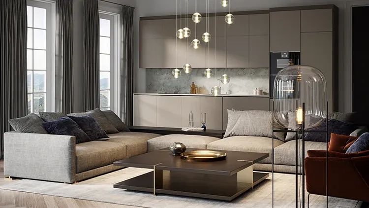
The first key to a great composition of CG lifestyle pictures is item layout. The product should always be the hero in a shot so that customers can instantly tell what’s being sold. Therefore, it should be in the center of a picture, visually dominating the space. If there’s a group of products, they should be close enough to each other so that the image can be cropped square. This is important for ecommerce listings and social media posts, where previews are always square. Plus, it creates a cozy atmosphere for the room.
#2. Color Scheme
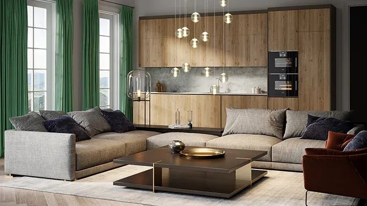
The main rule about colors in lifestyles is that they should complement the furniture without fighting for attention with it. For instance, bright and dark colors, as well as aggressive prints and ornaments, tend to distract customers from the main items in a picture. So, it’s preferable to use neutral colors, such as beige, gray, white, muted blues, and greens, etc. Also, it’s never a good idea to put furniture against walls of the same color, or on carpets of the same color. Because this way, items just blur with their surroundings into one big spot.
#3. Lighting
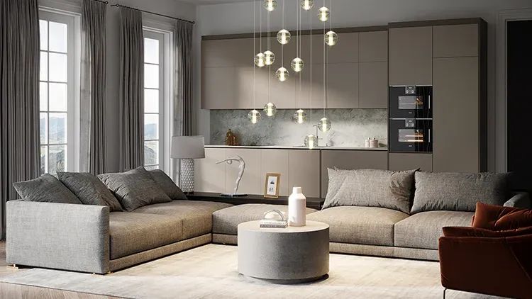
Lighting in lifestyle pictures must be soft and even, with no high-contrast light patches or unattractive shadows. This might happen when the main light source in a picture is natural sunlight. It’s tricky to work with, so 3D artists always need to adjust contrast and brightness in such cases.
Furthermore, expertly-set lighting can highlight a product’s texture in the most flattering way. Soft furniture with leather or velvet upholstery benefits the most from it. However, it’s incredibly easy to overdo that, especially when putting items next to windows. Here, it can be helpful to use some curtains to soften the light.
#4. Accessories

Accessories in lifestyle pictures should always be of the same style as the main product. Just a few trendy items are enough to create a realistic look for the room. Checking the composition, one should look out for objects lying on the floor - there should be none. Otherwise, the space will end up looking cluttered, messy, and totally unattractive for buyers.
Then, it’s important to remember that accessories in lifestyle images should help to show a product’s proportions. Therefore, the size of secondary objects needs to correlate with the size of the main ones. For instance, a coffee table in front of a sofa should be of suitable height, so that one could easily reach it while sitting - just like in real life.
Finally, accessories should always take up less space in lifestyle pictures than the main items. 3D visualization of light fixtures, small furniture, and house plants is perfect for the job here. A couple of decorative pillows can’t hurt either. But things like fireplaces, large bookshelves, bright artworks, and busy window views tend to drive attention away from the product. So, they should be avoided at all costs.
#5. Angles
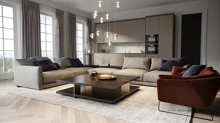
There are two main angles that are used in lifestyles - the ¾ angle, or the corner view, and the front view. Here, the rules are rather simple. Firstly, there should be no distortions of the angles. They happen when a view is tilted up or down too much. As a result, the furniture appears disproportionate and the whole picture looks weird. And secondly, no objects should be covering the main product. If that’s the case, the layout needs to be rearranged.
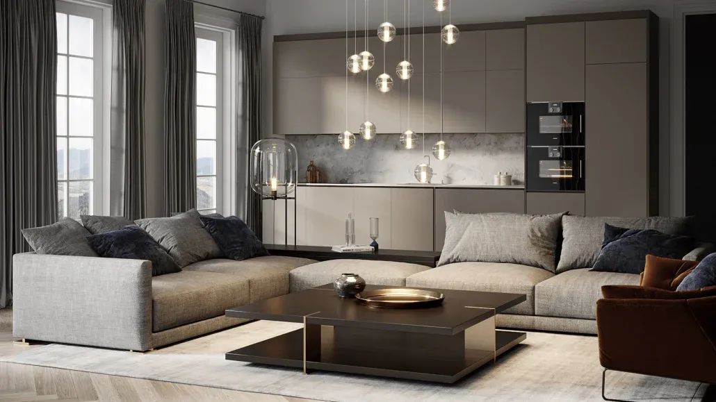
Well, those were the 5 keys to the perfect composition of 3D lifestyle pictures. When done right, they can be a truly great sales-driving asset for furniture makers. However, if done poorly, they can harm a brand’s reputation and affect sales in a negative way. Therefore, learning those 5 simple rules is incredibly important for anyone who uses or is considering using CGI for their business. Armed with this knowledge, manufacturers can always be sure that their 3D visuals are real eye candy for their customers.
Are you interested in product modeling services for your furniture business? Contact us and get mind-blowingly photorealistic lifestyle visuals in no time at all!
