Product shots are the primary way to showcase the merchandise both in printed catalogs and online. There are various types of images to choose from. More often than not the manufacturer goes with a silo as a primary visual asset. They do give a general impression of a product and create a sense of consistency on a product listing page. However, it is impossible to figure out the specific details of a product from such an image. As a result, the buyers are not sure of their choice while making an online purchase. And, even if they do buy an item, the return rates are high and increase proportionally to the rise in online sales. Enriching the e-commerce page or catalog with close-up renders presents a solution.
As a 3D rendering company , we are always looking for ways to make online marketing more appealing and efficient. If you want to know how to use close-up CG images to ensure your marketing visuals are both stylish and informative – read on!
1. Explore Product Design Details
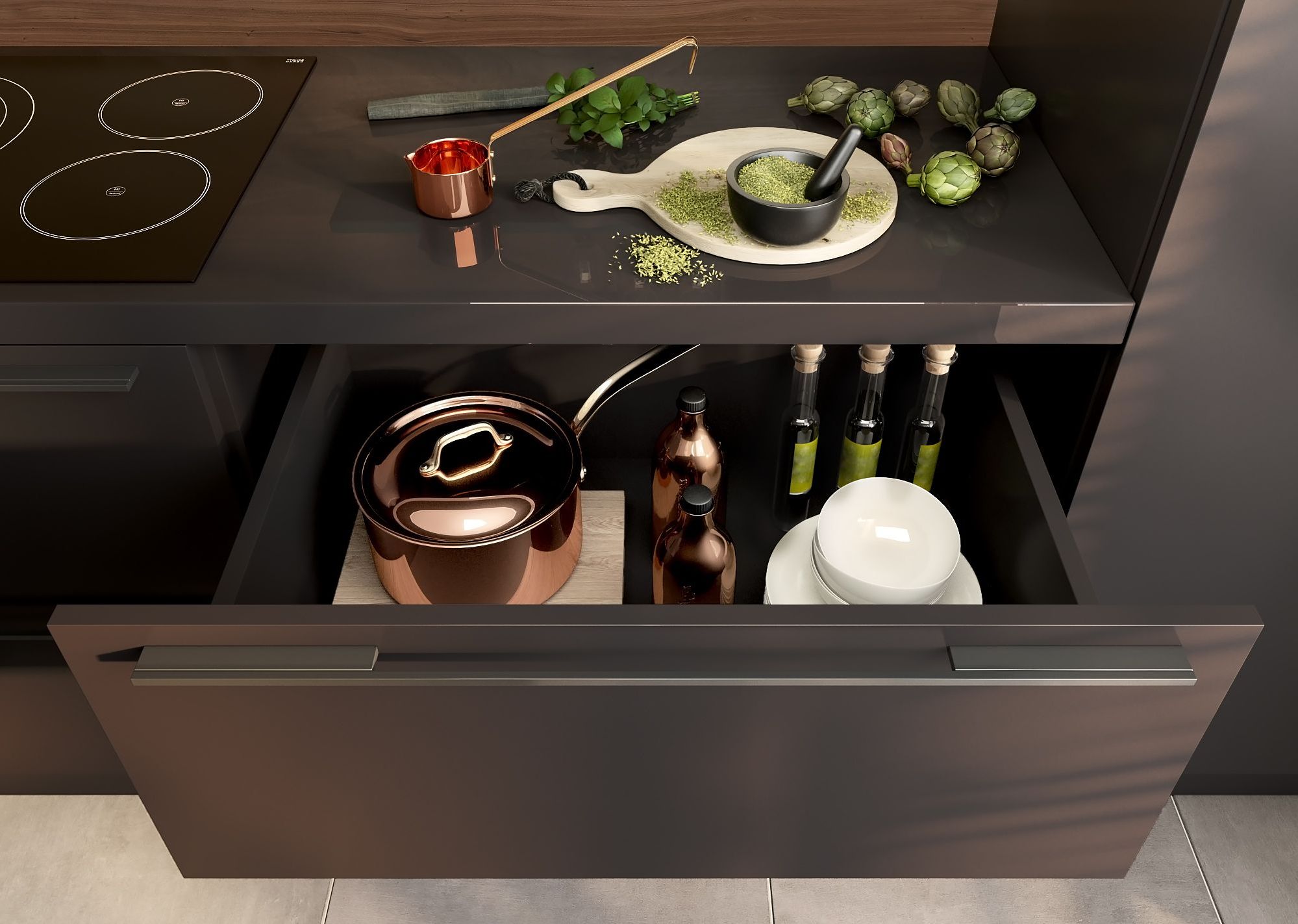
As one of the eCommerce product page essentials, close-up renders are perfect assets to ensure the customer can get a proper look at the design details – almost as if they were in a brick-and-mortar store. Compared to photography, 3D renders leave more room for experimentation and creativity. Building an actual set to shoot lifestyle images is a long and expensive process. And without them, close-up photos on the neutral background will more often than not look technical and sterile. CG close-ups can be combined with lifestyle images . They convey not only information but also emotion. The viewer gets the vibe of an interior and can picture the lifestyle which goes with it. When such renders focus on a detail, it is easier to place it mentally in your own space. Lifestyle renders allow one to establish a connection with an item even before it is bought.
In addition, with 3D renders, any design changes can be made quicker and more cost-efficient. It is vital for the marketing of small companies which will want to save money on building sets and professional photography. But it also works for the market monsters such as IKEA. They made the transition to CGI in their catalogs years ago .
2. Examine Product Materials

Studio shots convey the general forms and shapes of an item, while close-ups allow the exploration of materials. The name of the wood, fabric, or alloy on the product listing page won’t mean much to many customers. Close-up renders visualize them in such a way that the customer won’t get any surprises upon delivery.
If the item comes in a different material or color scheme, CG rendering will ensure the retailer has as many images as needed. 3D allows changing colors and materials with just one click. To represent such a variety of options with actual photos, the manufacturer will need to build all the prototypes. The cost of marketing in this case increases dramatically, along with the time it takes.
3. See Texture in Detail
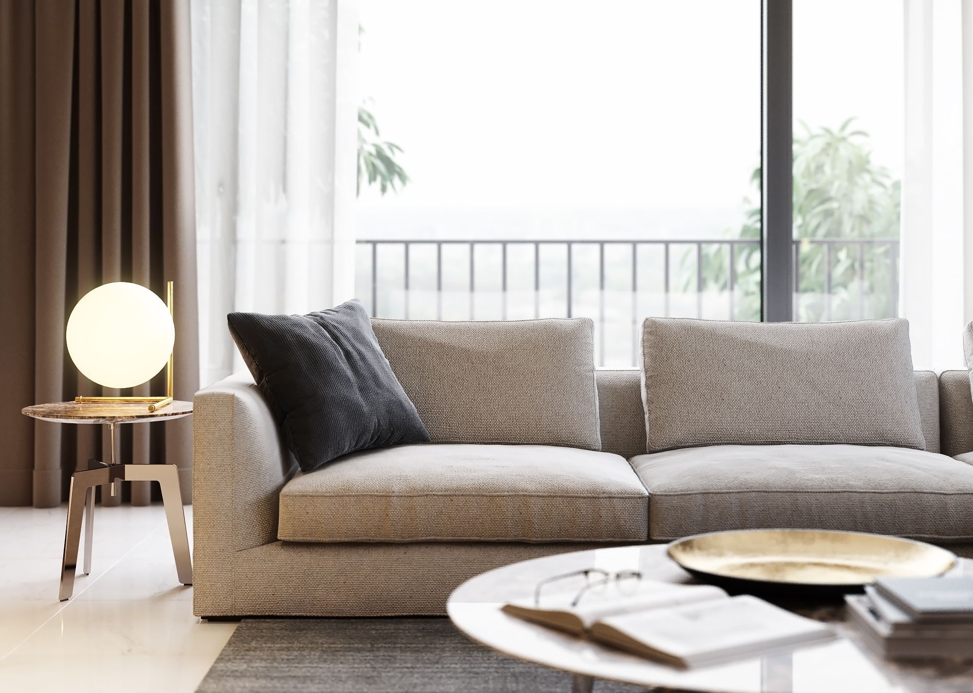
Patterns, color nuances, and that plush-like texture that makes a customer want to sprawl on that sofa immediately – all of this can be lost in silos but will shine in close-up renders. Taking photos that focus on the texture might be tricky as lighting and limitations of technology come into play. With CG renders, the retailer can get the exact feel they are looking for. Moreover, being able to zoom in on the product will also add interactivity. In its turn, it significantly increases the purchase intention, especially with the more expensive goods.
4. Make Sure There Are No Flaws

Close-up renders allow customers to see for themselves there are no manufacturing defects and that everything is what it seems. With the furniture, it is especially vital to ensure the item is flawless and will make a perfect match for the interior.
On the other hand, using 3D renders instead of photos precludes accidental faults like fingerprints, dust, or any manufacturing imperfections from creeping into the image. CGI is consistent and brings forward the manufacturer’s ideas and designs as they should be.
5. Confirm the Quality
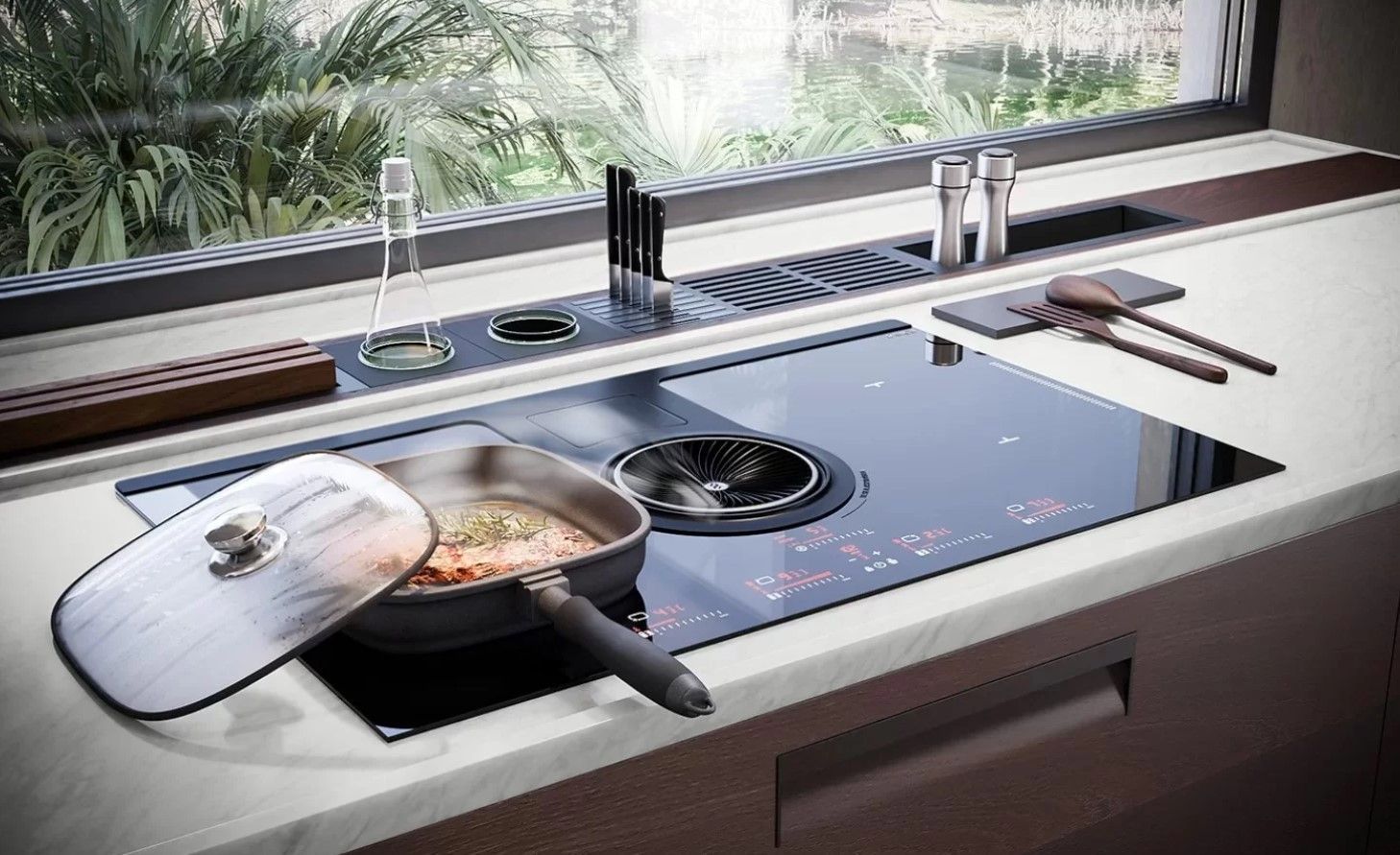
All the fixtures, linings, nails and screws, seams, and stitches are there to see in the close-up renders. CGI is perfect for highlighting the details which speak for the item’s structure and sturdiness. A component or cutout shot can be used to demonstrate vividly the inner structure of a furniture piece – and the manufacturer will not need to build a prototype for it, just include the schematics in a brief. In addition, this way, the customer can see more vividly how the piece works if it’s something one is supposed to interact with.
Close-up renders provide additional information on the product, its specific features, and its workings, which allow the buyer to make a more informed decision and leave them more satisfied with their purchase. The larger number of such detailed images leads to higher sales and reduces the perceived risks of making online purchases.
Want to see more examples of close-up renders made by our team? Check out our case study on door hardware modeling and rendering.

CGI is a powerful tool that allows manufacturers and retailers to obtain varied and appealing visuals for their product listing pages. If you are looking for lifestyle 3D product rendering services to boost your sales with versatile photorealistic imagery, contact our team!
