Launching marketing and promo campaigns, manufacturers and sellers may spend thousands of dollars on photo shoots. They order and transport prototypes, rent a photo studio with backdrops, hire a crew of photographers, stylists, and assistants – the list goes on and on. And if in the end brand marketers get bad images of products for sales, it leads to the highest level of frustration. Thus, the biggest question is how to wisely invest in visuals and get competitive images for sales and promo.
In eCommerce, bad visuals are deal-breakers as they are not reliable enough. Of course, customers won’t be eager to risk their money when they are not sure about product quality. So no matter how eloquent the text description is, shoppers will buy from your competitors with nice and detailed imagery.
So what are the most common mistakes in product visuals and is there a way to turn bad images into good ones? Specialists from our 3D rendering company know exactly how to fix the most common flaws of product pics to improve your sales. Read on!
1. Low-Resolution
The biggest difference between good and bad images of products for sales is resolution. When zoomed in, low-res pictures are getting pixelated and blurry to such a degree that it’s impossible to see the object’s texture and details. Such images look cheap and unreliable, thus, buyers begin to doubt even the quality of the product itself.
To solve this problem, brands should switch to high-resolution visuals for sales and marketing. Hi-res images can be zoomed in and out and the image quality will remain good showing all design features. Pro tip: to emphasize the quality of the texture even more, add a close-up view of an item to a listing page.
2. Too Many or Too Distracting Props Around the Product
When it comes to furniture sales and promo, brands know they must show their goods in a well-thought-out environment. Lifestyle images help buyers understand the proportions of a furniture piece and how it fits in a suitable interior style.
However, bad images of products for sales contain too much stuff in the frame — props and accessories, unmatching patterns, etc. Such busy lifestyle pictures confuse customers and distract them from the main product. To make it right, you can use a product image on a white background or a simple lifestyle picture focused on the main item.
3. Overexposure or Under-Exposure

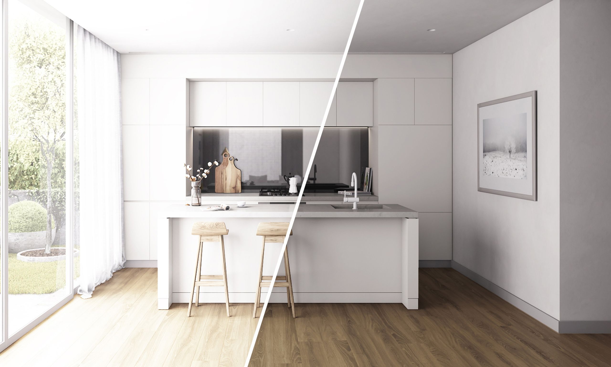
Often, bad product images are ones created with the wrong lighting settings. When a picture is over- or underexposed, it looks too dark or too bright. In both cases, buyers see these images as amateurish and untrustworthy. It becomes obvious that a brand hires non-professional photographers or 3D artists, which reflects poorly on people’s perception of the product itself.
To get visuals that work best for sale, reach out to experienced specialists who know how to set up the lighting. When working with professional 3D artists, manufacturers can request any lighting scheme they want. CG experts will set up the needed intensity, temperature, and tone of light in just a couple of clicks. The result not only looks realistic but also highlights the product and conveys the mood the way marketers want.
4. Odd Product Positioning and Angles

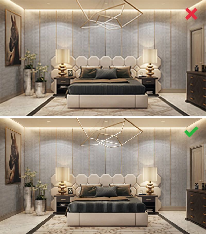
Another common misconception among brand marketers is that pictures with creative composition will guarantee them getting the customers’ attention. However, odd angles may distort the proportions of the object and have an opposite effect on buyers. They won’t be seen as creative but rather as bad images of products for sales.
The thing is, getting an item of the wrong size is one of the biggest fears customers have, especially when it comes to furniture. They have to be sure the product will fit in the needed space. So the best solution would be not to experiment with angles but to use standard types of product images — for example, front and side view, and ¾ angle.
5. Disproportionate Objects
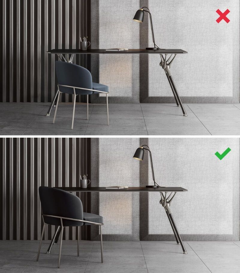
This mistake can happen with product 3D render. Surely, top-notch CGI looks 100% realistic, however, it all depends on the level of CG artists’ professionalism. When amateur CG specialists fail to scale 3D models correctly in 3D software, all objects look disproportional and distorted. Needless to say, these are bad images of products for sale because they look weird and fake. To avoid this problem, brand marketers need to change their CG provider and turn to experienced 3D specialists with high-level skills.
6. Distorted Colors
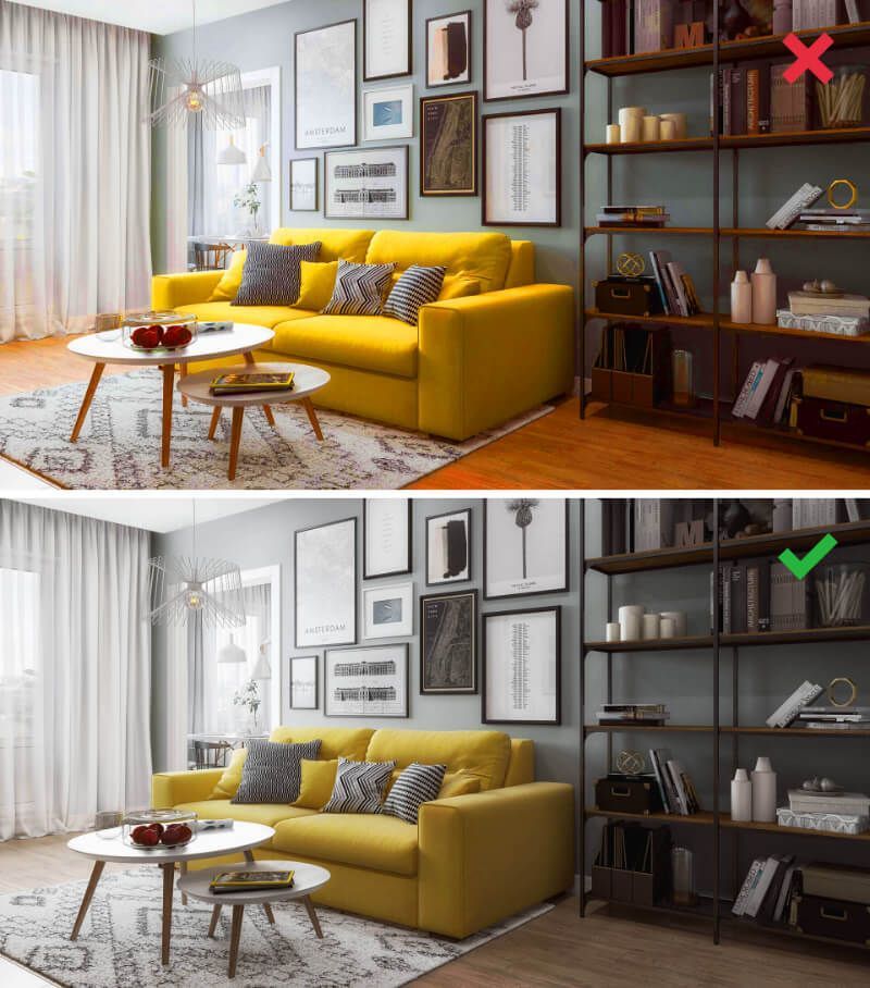
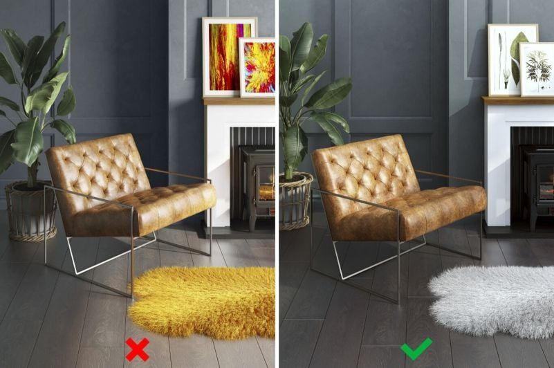
Wrong color reproduction also makes bad images of products for sales and marketing. If, in reality, the color of a piece doesn’t match the color in the photo, buyers most likely will return it. Usually, image colors get distorted during post-production when graphic specialists start to tweak the contrast and brightness. These manipulations may make all objects look brighter or, on the contrary, paler than they really are.
Our tip on how to get images that do good for your sales is to entrust them to professionals. Before starting a project, send your CG artists references that represent the color scheme you need. In turn, they will use up this color palette in a 3D scene and then carefully tweak colors and hues in post-production.
7. Only One View of the Product

No matter how beautiful a product image is, having just one view on the listing page is not enough for driving sales. Just step into buyers’ shoes for a second. Would you trust a single image or would you like to see more angles to understand the design? Probably, the latter.
To help shoppers make an informed choice, manufacturers and sellers should provide them with plenty of visuals — a furniture piece in the room set, different product views, a close-up and cut-out views. To put it simply, the more images you add to the listing, the higher the chances of selling a piece. Experienced marketers go further and even add 3D animation to show the item in action, and upload a 360° product view with a zoom feature.
To avoid getting bad images of products for sales and promo, brands shouldn’t cut corners on professional product pictures and CG services. Otherwise, they get low-resolution pictures, over/under-exposed visuals or images with distorted colors. Another mistake is trying to win customers by overdoing it — choosing weird angles or making the background too busy and distracting. None of this happens when brands collaborate with experienced CGI studios with standout portfolios and years of expertise.
Need quality CGI for marketing and sales? Click here to order 3D rendering services from us and get stellar product images that show your furniture in all its glory!
