3D product renderings help to not only promote the goods but also make a statement on the market. Using flawless photorealistic 3D visualization for visual marketing ensures a strong response from the target audience and attention to the products.
More and more Furniture Manufacturers that have only used photography before want to try CGI as an alternative. Organizing photo shoots takes too much time and effort, starting from renting a location and ending with transportation. The only problem with cgi rendering services is that it’s hard to distinguish high quality from low quality for an untrained eye. Ordinary viewers may sense that something is wrong with images but can’t pinpoint the exact cause of it. So how will Furniture Manufacturers know who is a professional 3D visualization contractor and who is only a beginner?
As an experienced CGI studio, we made a list of common rookie mistakes that can help Manufacturers to identify inexperienced 3D Artists and choose professionals instead. Moreover, these 10 common errors are useful for controlling the whole 3D visualization process and making the right corrections.
1. Floating and Intersections
When looking at 3D product renderings, the first thing that strikes immediately is intersecting and floating objects. This is the most frequent mistake done by inexperienced specialists and something that clients will never encounter while working with professional 3D rendering studios. Even untrained eyes can notice if something is not at the right place, and 3D objects floating in the air are more than apparent.
2. Perspective Distortion
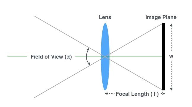
Wrong settings of a focal length lead to perspective distortion, which is a classic rookie mistake. The main consequence of this error is bent and twisted objects that don’t look like they normally do in real life. The fisheye effect on 3D product renderings is the first indicator of perspective distortion. In order to avoid it, 3D Artists need to know one simple rule – focal length cannot be less than 24 mm.
3. Mismatching The Real Scale
Often, newbie 3D product rendering artists put objects into a scene without paying attention to the dimensions of Manufacturers. The result looks ridiculous – small chairs with big table lamps or doormats stretched up to the size of a living room carpet. The solution to this problem is quite easy, which is relying on manufacturing standard dimensions from drawings. The second step is to compare the parameters of the product to other objects in the 3D rendering scene and make sure that all of them match real sizes.
4. Low-Quality 3D Models
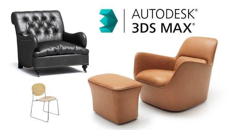
The easiest way to ruin 3D product renderings is to use low-quality models. There are plenty of available 3D objects online, so it’s important to choose only the best ones. Inexperienced 3D Artists can recognize them by a few essential properties. High-quality 3D models have flawless geometry, smooth surfaces, and carefully crafted details. This is the only way to make product CGI the most accurate representation of the real goods.
5. Substandard Textures
Low texture resolution is another reason for failed 3D product renderings. Blurry patterns and unrecognizable details on the surfaces of objects are the main signs of this mistake. Such low-quality textures don’t allow viewers to recognize what kinds of materials are used for products. Moreover, it makes all surfaces look unnatural and flat. The solution to this problem is obvious – download only high-resolution textures.
6. Tiling Textures
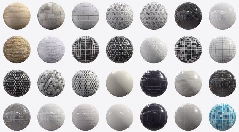
Noticeably repeated patterns are a clear sign of bad texturing. This issue is called tiling. It usually happens when low-quality textures are used. Professional 3D artists know how to make tiling seamless. However, many beginners cannot blend textures well enough. Using high-quality textures helps avoid visible seams and creates smooth transitions between texture patches. If you are having trouble with this or need many 3D models or materials quickly, consider using 3D modeling and texturing services. This will help you get both excellent quality and fast delivery.
7. Unnatural Light Intensity
Any 3D product renderings can be spoiled by excessive or insufficient light effects as well as inadequate usage of them according to light sources. For example, natural lighting can never be less bright than electrical devices. On the contrary, the main light at night mode is located within the scene. Also, it is highly important to give a different level of brightness to all light sources to differentiate the main and secondary lighting. As an example, the chandelier usually has more intense light than a desk lamp or ceiling light spots.
8. Objects With Different Light Exposure
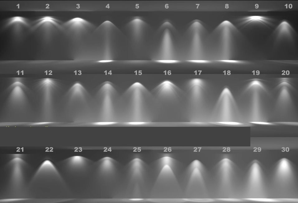
Another common mistake is incompetent posting and scene-setting in accordance with light sources. For avoiding this flaw, rookie 3D Artists need to remember simple physical laws. Shadows should be falling in the opposite direction from the main light, which is the same for all items in the scene. Objects that are closer to the light source have to be more bright than those that are further away. For example, an armchair placed next to a lamp should be lit up.
9. Noise and Serration
Noise and serration might occur at the final stages of post-rendering and could be visible on low-resolution images, especially if they are posted online. If the picture size is larger than the website authorization, the serration and noise will be very apparent. The same goes for small images printed on large-scale papers. Experienced 3D Artists always tweak the resolution of 3D product renderings by the required formats of images.
10. Too Bright or Too Dark Areas
Contrasting is a vital part of the post-production stage but overdoing it can easily ruin 3D product renderings. Professionals always get rid of entirely black or white areas on a picture as it greatly damages the photorealistic effect. Moreover, too much sharpness in contrast settings makes product renderings look very unnatural. The efforts of a 3D Artist will go in vain because excessive photoshopping overshadows the details of all previous work.
The quality of 3D product renderings solely depends on the skills and experience of CG specialists. Even a few mistakes can make images less realistic, and a product won’t look as appealing as Manufacturers want. This article will help to identify typical errors of inexperienced 3D Artists, hence avoiding unprofessional rendering contractors. Just look at any 3D visualization portfolio! Found something from this list? Then it’s better to hire someone else. If you didn’t find anything similar, you are lucky – this product rendering studio is professional and reliable.
Want to get photorealistic visual materials for promoting your products? Use custom 3d modeling services and get high-quality 3D visualization in no time.
