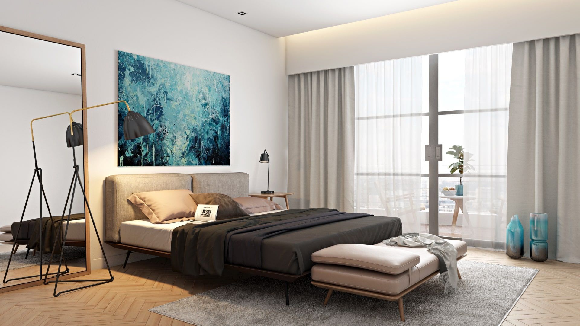
Product design rendering is an essential part of furniture marketing while placing items in a perfect setting is a craft in itself. A perfect scene for 3D model placement is many things — it looks real, attractive, welcoming, and balanced. A fair requirement for it is to not be overbearing but rather serve as a background for the goods in mention.
There are cases when the scene is chosen wrongly – it either doesn’t match the product, is too heavy-laden with details, draws attention to the wrong items, or is stylistically incorrect. As the result, the shopper misses catching the benefits of the product, gets distracted or has the wrong idea about what is the main item. Thankfully, there are basic secrets of 3D rendering artists that solve the problem of unflattering backgrounds in product images. These are simple but fair directions to follow when choosing a perfect setting for a product’s 3D model.
Starting With a Product’s 3D Model
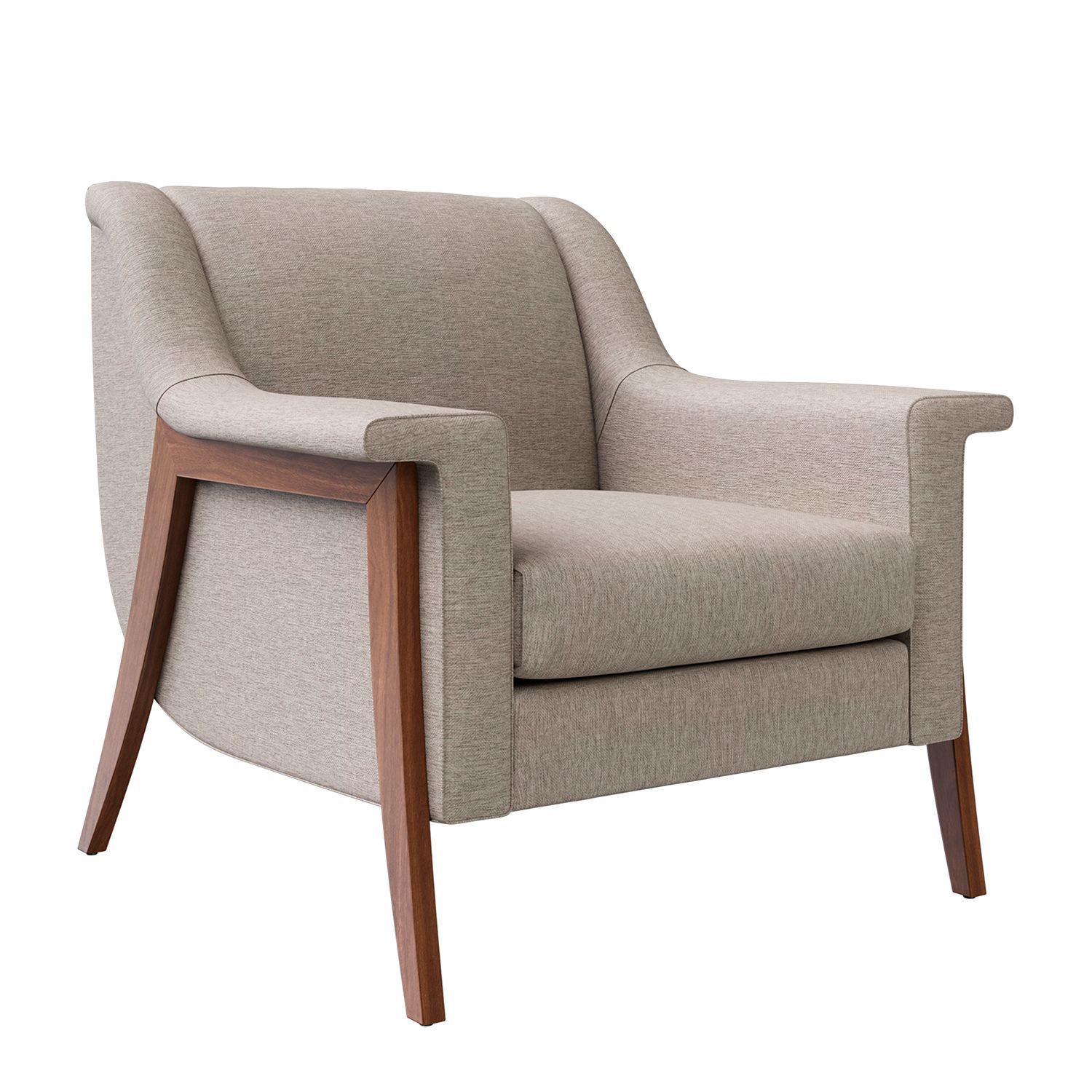
Yes, product design rendering naturally starts with the item itself. The 3D model of a given piece should be very well cooked before it’s introduced into any rendered background. After all, it’s the main product, the rest is just the setting, so it should be done with no compromise on quality or visual structure.
To build a well-workable digital model of an interior piece, an artist requires quite a feasible input. The latter would include several decent photos from various angles, product schemes, and sketches, and examples of fabrics, materials, and finishes. Let’s say a furniture company designed a set of dining room chairs with soft fabric seats and wooden legs. Both seats and legs have three variations. Seats come in a choice of maroon velour, turquoise oxford weave, and deep Mocca twill fabric, while the legs are finished in oak, greystone, and walnut. A 3D specialist should include all of these specs before rendering together a model.
Choosing References With Best-Matching Interior Designs
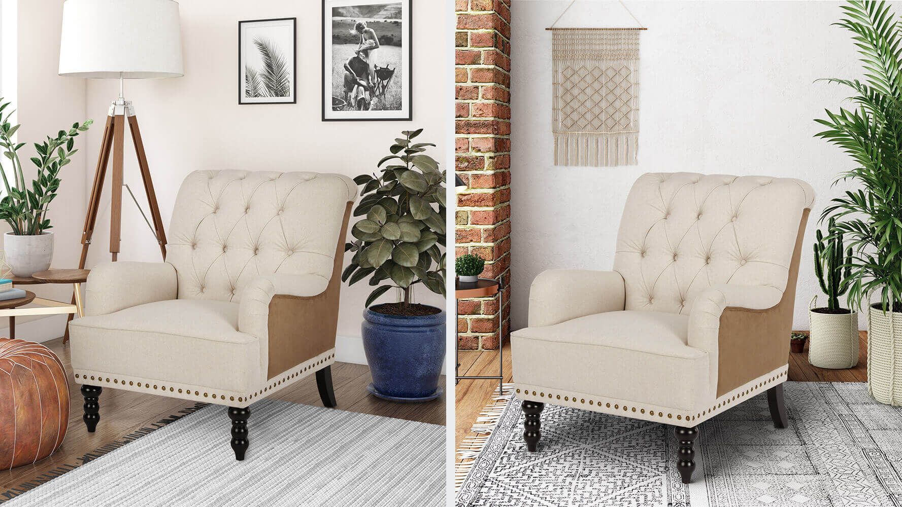
Nothing exists in a void. When designers or artists create something, they envision it in some sort of context. The context might be trends, target audience preferences, or artists’ creative visions. So it goes with furniture product renders as well – as part of the final vision, they are meant to fit well in certainly finished interiors, and correspond to specific styles.
As part of the product design rendering for a specific furniture item, it is important to have a clear, agreed-upon understanding of the types of interiors it was meant for, or which types of surroundings will bring out the most marketable good out of the given piece. For example, a Mocca chair design with legs in oak finish will fit great in a dining room with lots of natural light and greenery, while the same chair in turquoise and greystone might play better with minimalistic chrome-induced surroundings.
Creating a Commensurate and Relevant Layout
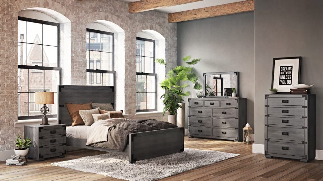
Once the 3D model of a furniture piece is perfected and there is a clear vision for interior styling, a big chunk of important product design rendering work is still ahead. When crafting a full interior layout, a 3D artist should be mindful of creating the setting according to rules for proportionate relations.
Part of the job is picking the hues and finishes of the relevant surrounding that will support but not overbear the item’s design itself. The other chosen interior pieces should ensemble well with the marketed one. This is the stage when a product rendering artist should show interior design skills, as well as a general understanding of the industry.
Considering Natural Surroundings and Wider Context
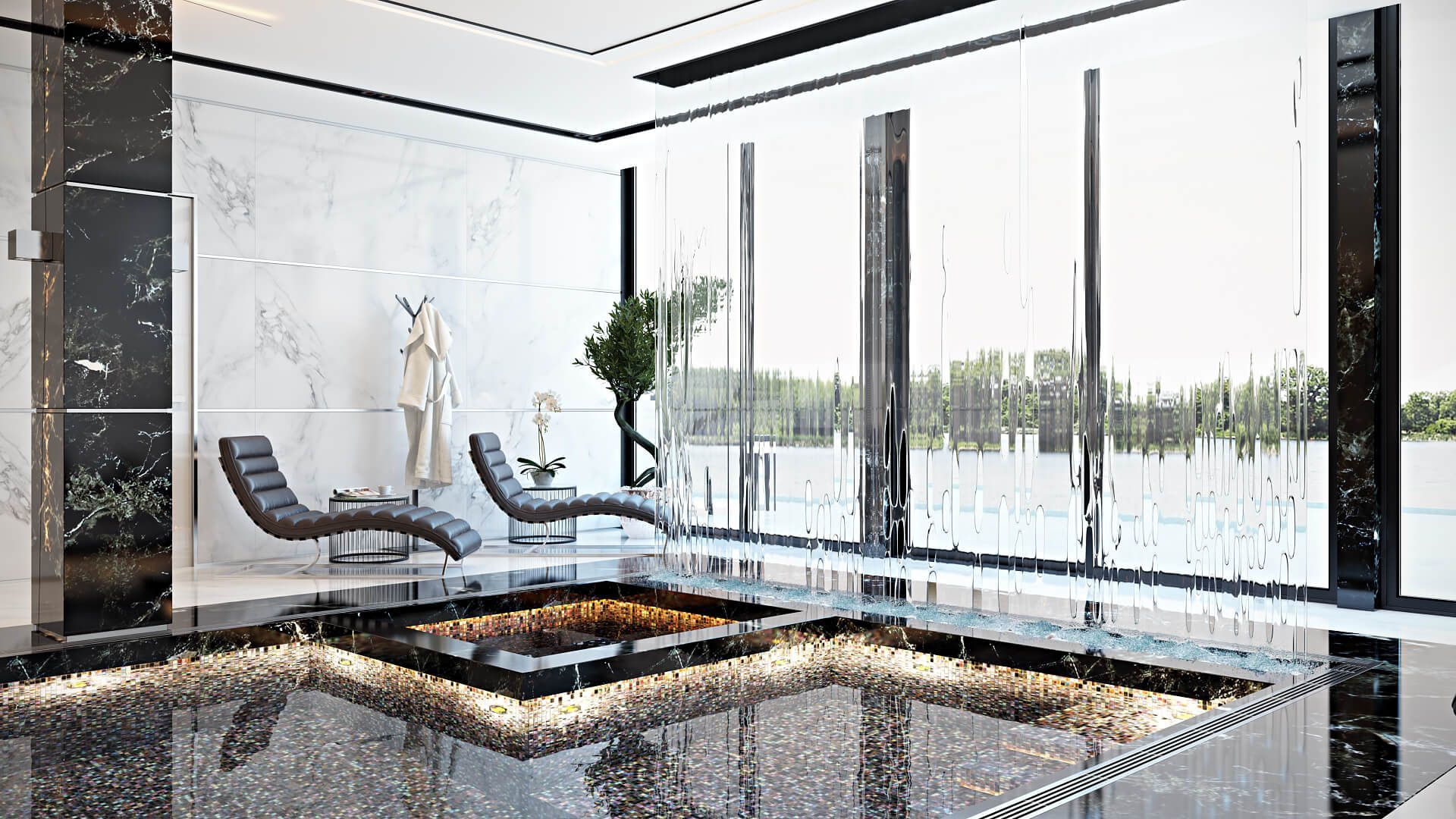
What often sets a good product design rendering work apart from a not-so-good one is the sensation of how natural the finished work looks and feels. Of course, a big part of it comes from stellar composition, realistic proportions and overall tastefulness of the end visual. The important last stroke, however, is to envision a broader context and integrate it into the final layout.
The good questions to ask would be: What is the season outside? What time of the day plays best with the intended scene? What is behind this room? Where are the entrance and windows? Where are the sources of light? Once there is a broader picture, it’s easier to create a relevant finished visual. If the particular room is set up in New York, it might bear different elements than if a similar room is set up in Lissabon. A cold season outside might be reflected in a woolen wrapper on the couch. Light sources are crucial as well. Natural light and light from electronic devices should best be combined by the professional photography rule of the three-point light source. This is known to give a vibrant natural result all marketers strive for.
Sticking to the Golden Ratio and Other Composition Rules
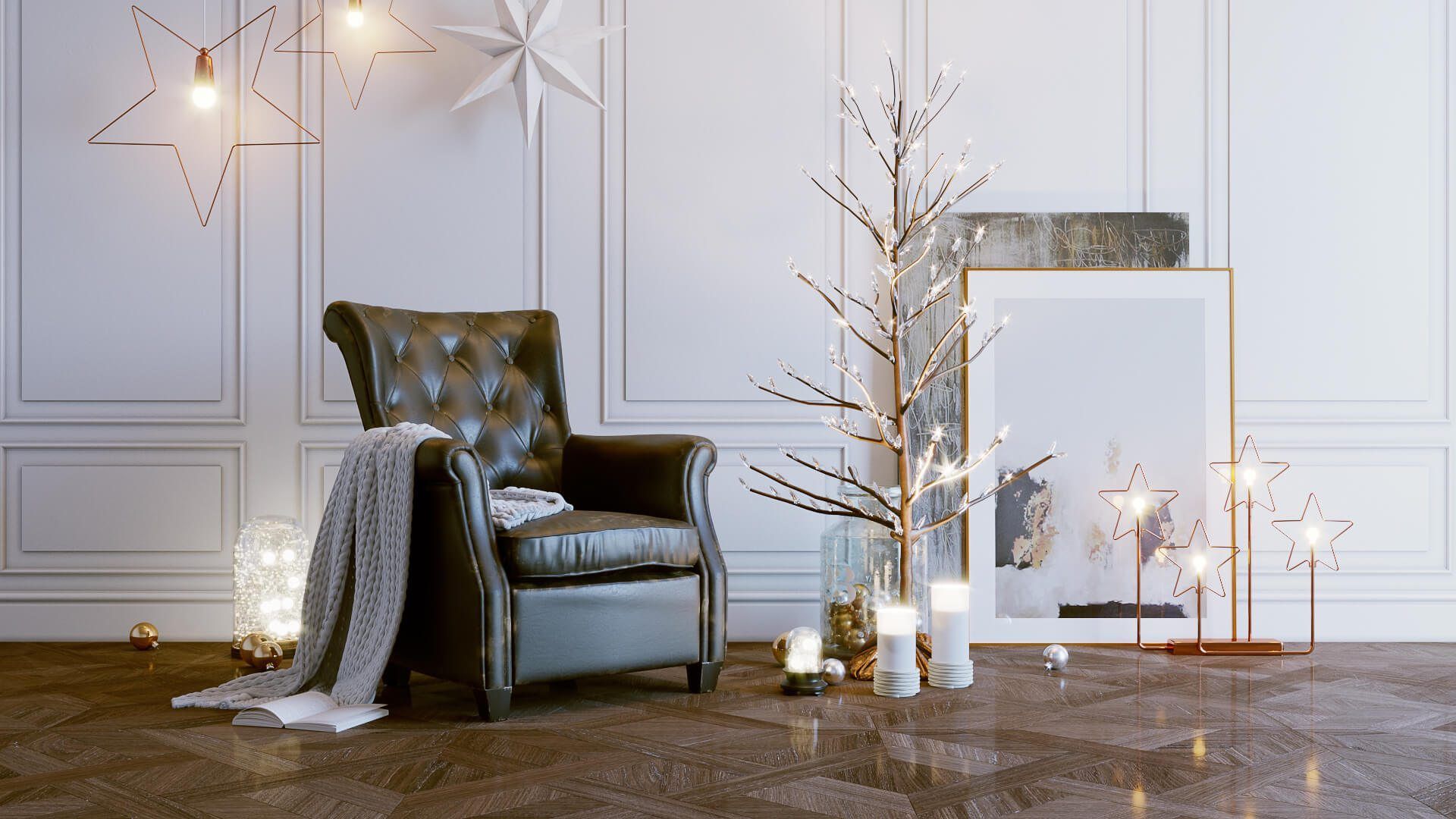
The science of the golden ratio stems back from antique Greece and the first mathematicians, who discovered the essential rules of harmony. Ages have passed, yet no one was able to debunk the idea of the golden rule and the fact that the human brain decodes it as the most natural, and thus beautiful, composition of things. There is complex math involved in the rule, boiling down to the famous number Phi. To make it simpler to the eye of the beholder while applying to product rendering, one may divide a visual into roughly 10 parts, and have some sort of a conceptual division between 7 and 3 parts. This may be reflected in counteracting light and shade, space and furniture, visual splitting of a room, etc.
Creating a perfect scene for a product 3D model might look like magic, but mostly it is a lot of skill, industry knowledge, and a certain level of artistry. A stellar product rendering will start with perfecting a 3D model of an item to be followed by a clear vision of the interior context where this item will flourish and draw the necessary admiration. The perfect scene for product design rendering is performed with stylistic congruence and mathematical perfection. It evokes pleasure in the beholders, which is beyond reasoning. All of this will serve precisely the marketing goal of selling the right product to the right audience.
Here at CGIFURNITURE, we’ve got all of these ingredients boiling. Our digital artists produce exceptional work, at pleasant costs, and within strict timing. Don’t hesitate to contact us and get photorealistic 3D rendering services!
