While allocating a budget for creating a furniture catalog, marketers and manufacturers don’t want to compromise on quality. However, if there’s a way to take pictures and save the company some money at the same time, they will gladly choose this option.
That’s why traditional photo sessions are slowly fading into history — they’re too expensive. First, you need to order a prototype, rent a studio with backdrops, lights and decor, and then pay the photographer’s fee. In turn, CG images mage by a 3D rendering studio take less and money time to make.
But 3D doesn’t always guarantee photorealism — if made by amateur 3D specialists, CG pictures may look fake. Such 3D renders are often over-saturated with color, objects may have weird proportions, and the whole image looks more like a clumsy collage.
So how do professional 3D artists avoid furniture looking fake and what tips to use for a photorealistic furniture catalog? Here you go, learn 5 sure ways to make jaw-dropping realistic product 3D renders.
#1. Use Only Top-Quality 3D Models
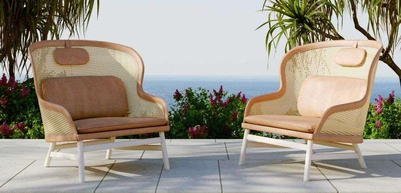
Our first tip may sound obvious but still, so many 3D artists making the same mistake over and over again. So first and foremost — use quality 3D models only. If you can immediately spot that the furniture piece is fake based on its geometry and textures, then this 3D model is poorly made.
To get photo-quality renders for the furniture catalog, make sure 3D artists you work with utilize high-quality 3D models. Such 3D objects are built with accurate geometry, they have smooth surfaces, and all the design elements up to the joints and screws look 100% real. Thus, when 3D experts apply textures to these 3D models and put them in a scene, the roomset looks natural and works perfectly for a catalog for furniture.
#2. Make Sure Proportions of All Objects Are Correct
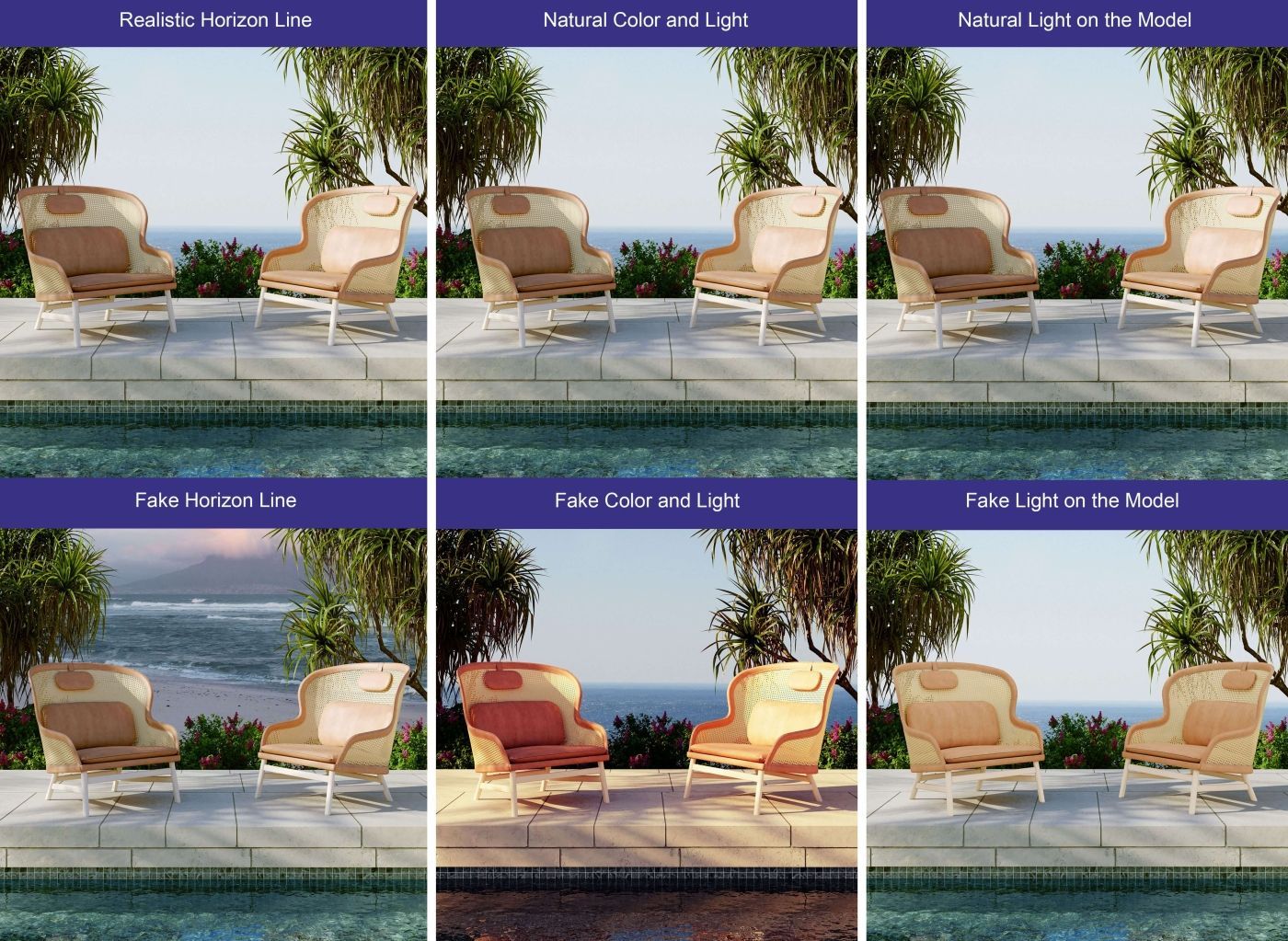
Since the lifestyle consists of not one but several objects like other 3D furniture, decor, plants, etc. — everything must be correlated within proportion and scale. That is, the dining table should have certain parameters so it doesn’t appear as small as a coffee table. Chairs, in turn, should be of a particular size and height so people can comfortably sit at the table.
When the furniture in the photos looks like it’s made for Lilliputian or Brobdingnagian, it becomes obvious that this is not a real photo but just a bad 3D render. Therefore, professional CG artists adhere strictly to proportions and scale when creating scenes for catalogs of furniture.
#3. Keep the Same Horizon Line for Both Products and the Backdrop
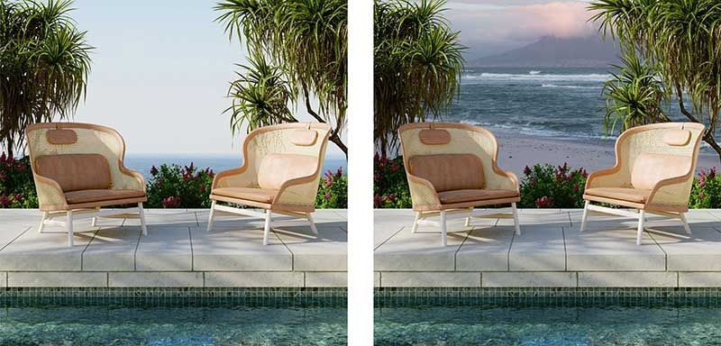
The incorrect perspective view is one of the most common mistakes in 3D rendering that makes bad images of products for sales. Usually, it happens because the backdrop and the product on the foreground were shot with different horizon lines. As a result, such a furniture 3D render visually falls apart, and the placement of objects is simply unrealistic. No surprise, these visuals are not an option for a decent catalog of furniture.
To make the background and main object look as if they were shot in the same scene, 3D artists have to align the horizon lines. This method provides a cohesive perspective view so that background and foreground work harmoniously and create the same optical illusion. Because of the correct horizon line, such 3D renders are simply indistinguishable from traditional photos in the furniture catalog.
#4. Stick to the Natural Color Palette
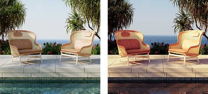
To get photorealistic, hence, natural CG images of furniture for the catalog, always choose a natural color scheme without over-saturation. It’s also quite a common mistake that amateur CG specialists make in post-production. When a non-professional artist wants to add warmth and coziness to a photo, they don’t set up soft light in the 3D scene but add some red and yellow color tones to the whole picture instead.
This “technique” immediately gives away fake pictures and low-quality post-production. It becomes especially obvious if there are elements of nature in the pic. In such cases, the blue sky, water and greenery turn red and “overcooked” in Photoshop which is unacceptable for professional CG artists and high-quality product images.
Using intense color correction may seem like a smart shortcut to a more cozy ambiance but such visualizations look incredibly fake. Let’s be honest, you simply can’t change the lighting without making adjustments to the whole 3D scene. As a result, over-saturated images do more harm than good for product promo and can be used neither for a furniture catalog nor even for SMM.
#5. Set the Realistic Lighting Scheme
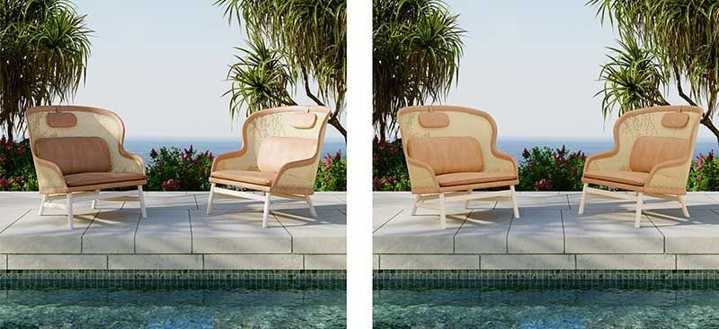
Since we have already started talking about lighting, let’s take a closer look at its settings. To get natural-looking catalog furniture pictures, it’s vital to set up the lighting in the correct way. This means that all lights and shadows must fall naturally both in the foreground and in the background of the 3D scene.
Surely, the idea to highlight the product with lighting seems logical. However, if the main product in the front is overexposed, then it looks flat and fake as if it was glued onto the background.
Therefore, the light source should work according to the laws of the composition of the frame. First, its angle and direction should be realistic and its brightness must be a medium range. On top of that, the lighting has to have the natural color tone and cast realistic shadows.
The best solution here is to use multiple light sources for furniture catalog images. In this case, 3D artists will be able to direct the main light source towards the product but soften it with additional lights and the correct bounce light settings. These techniques are often used for photos you see in catalogs without realizing how subtly and precisely the light is adjusted there.
To get photorealistic images for a furniture catalog, CG experts must make sure that all objects in the scene, including the main product and every accessory on a background, look 100% natural. In an organic furniture lifestyle image, all elements correspond to each other in scale, color, light and horizon line. Therefore, professional CG artists know how to prevent the fake look and any deviations during the rendering process.
Need jaw-dropping product pictures for your product catalog? Try our 3D rendering services to get photorealistic lifestyles for a catalog that inspires shoppers!
